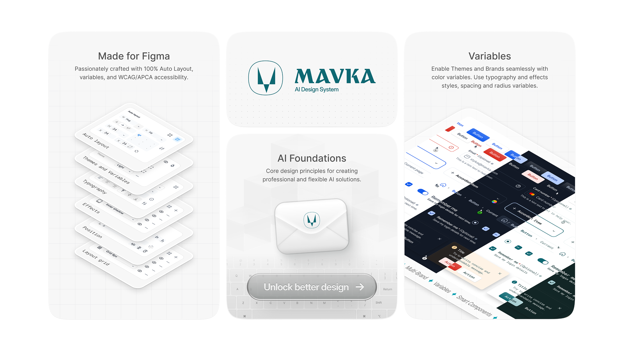
Choose the Mavka package for your workflow
Start with the Figma UI kit, add production-ready React components, or scale access across your team.
Start with patterns for chat, agents, dashboards, and data-rich workflows instead of rebuilding basic interface decisions for every sprint.
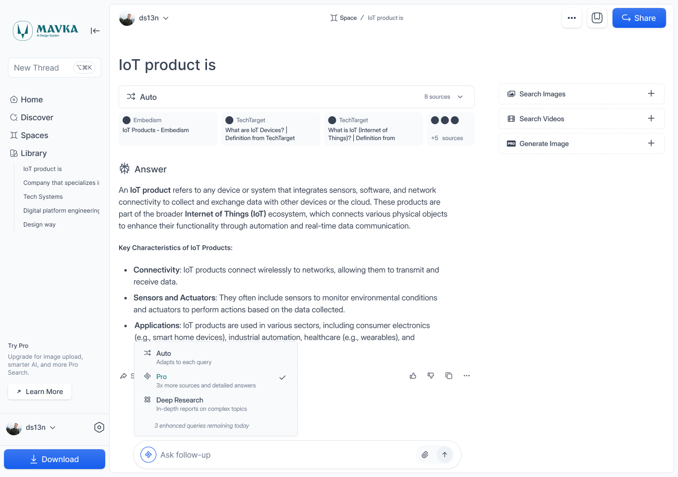
Expose tokens, component rules, and usage guidance in a format designers, engineers, and AI-assisted workflows can reuse consistently.
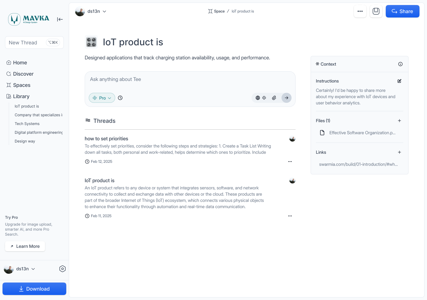
Use one semantic core for prototypes, client work, and multi-product portfolios so patterns evolve without fragmenting.
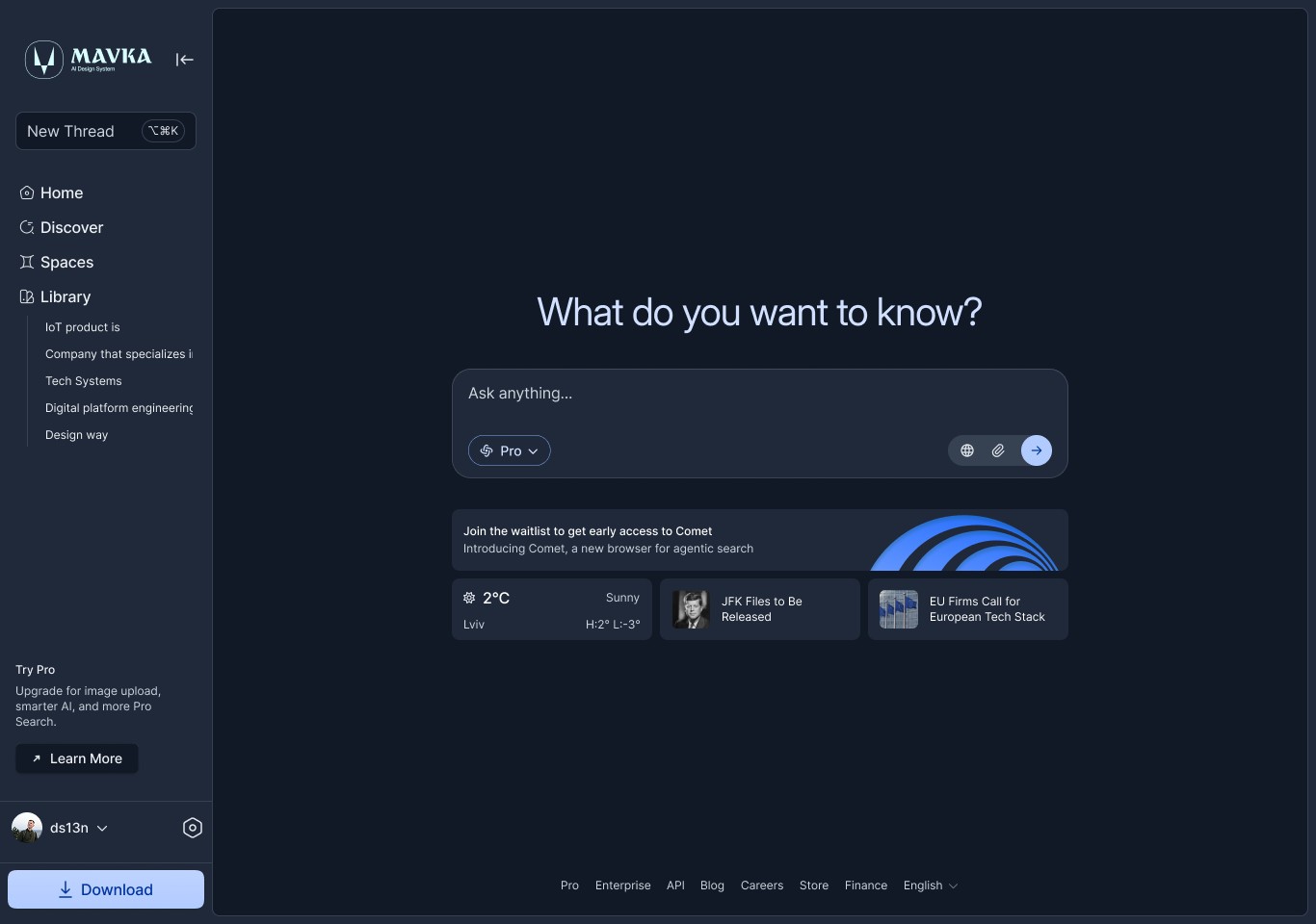
Design for variable-length responses, processing states, confidence signals, and non-linear journeys from the start.
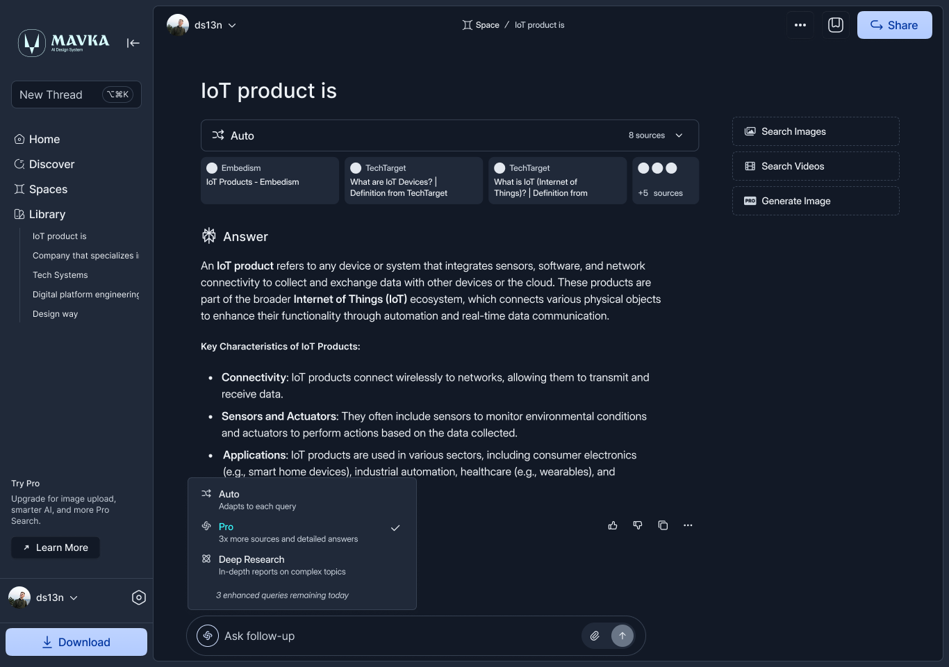
Connect tokens, components, Figma assets, documentation, and implementation notes so updates are easier to propagate.
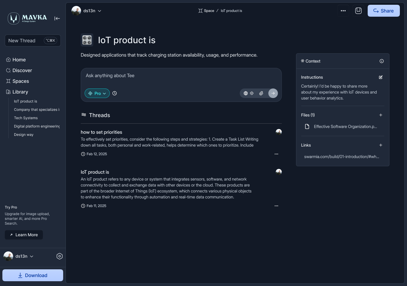
Move from exploration to shippable UI with variants mapped to real tokens and implementation-ready patterns.
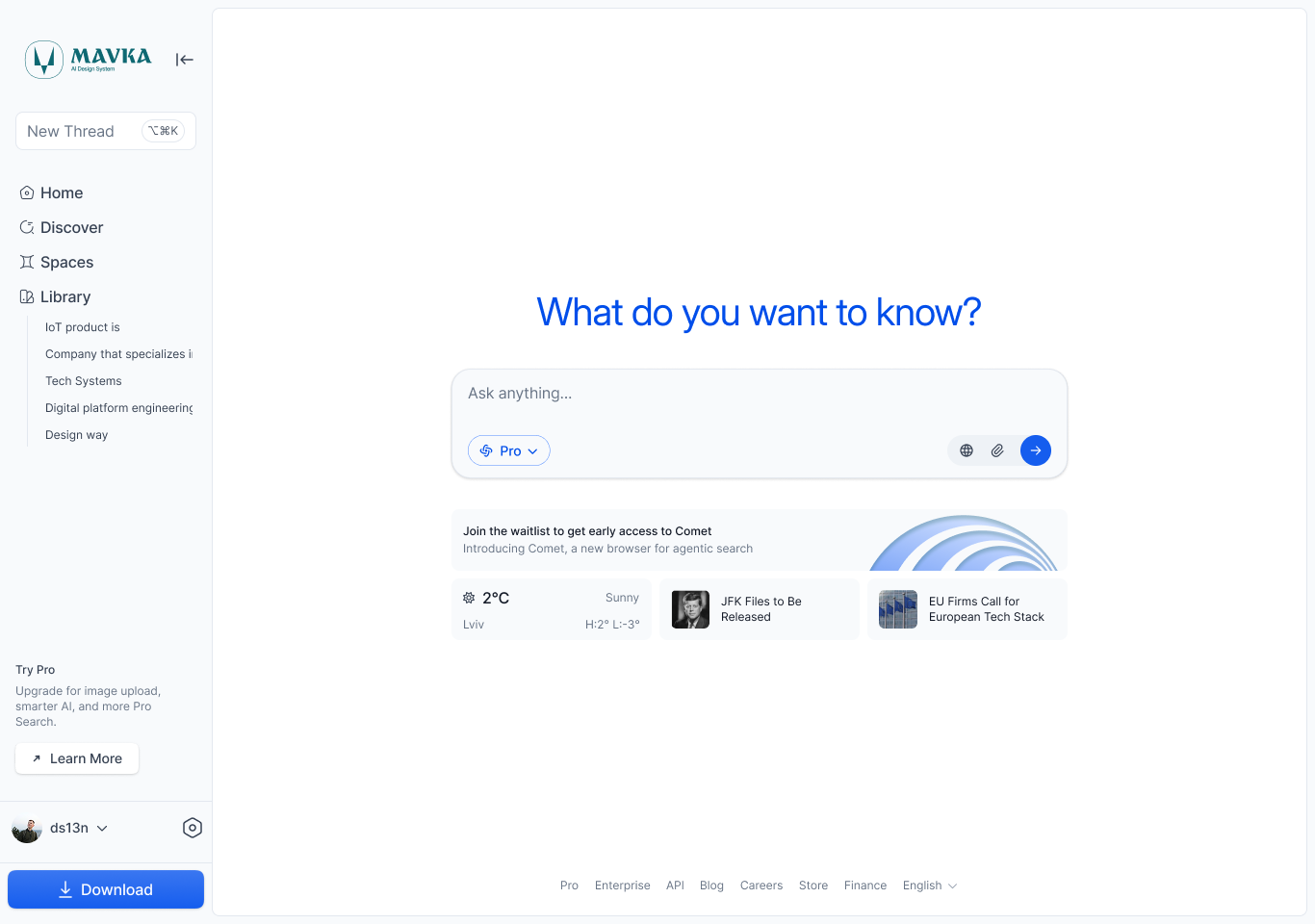
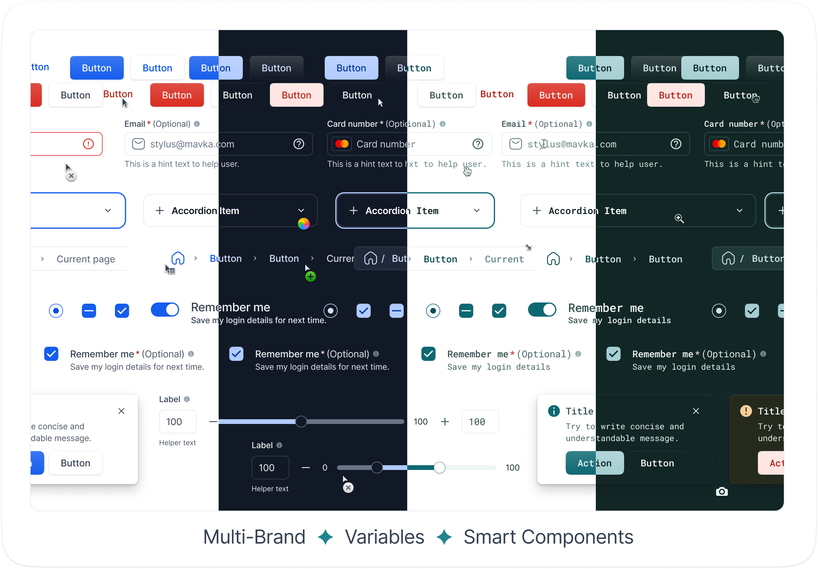
Start from tokens, themes, and components that stay consistent across brands, modes, and product surfaces.
Use 1,200+ hierarchical tokens for color, typography, spacing, states, and responsive behavior.
Switch between Light, Dark, and High Contrast foundations without rebuilding components.
Adapt one system across products, teams, and client brands from a shared source.
Ship patterns for chat, agents, multi-modal flows, streaming responses, and AI processing states.
Use ready-made pieces for chat, processing states, confidence indicators, and agent workflows.
Support text, voice, vision, and hybrid journeys with consistent interaction models.
Reduce blank-canvas work with patterns designers can explore and engineers can ship.
Keep contrast, focus states, layout behavior, and scalable type in the system from the start.
Build with WCAG/APCA-aware color, typography, and interactive states.
Support English and Ukrainian content with layouts built for variable text lengths.
Work from 6,500+ icons, production-ready vectors, and documented component states.
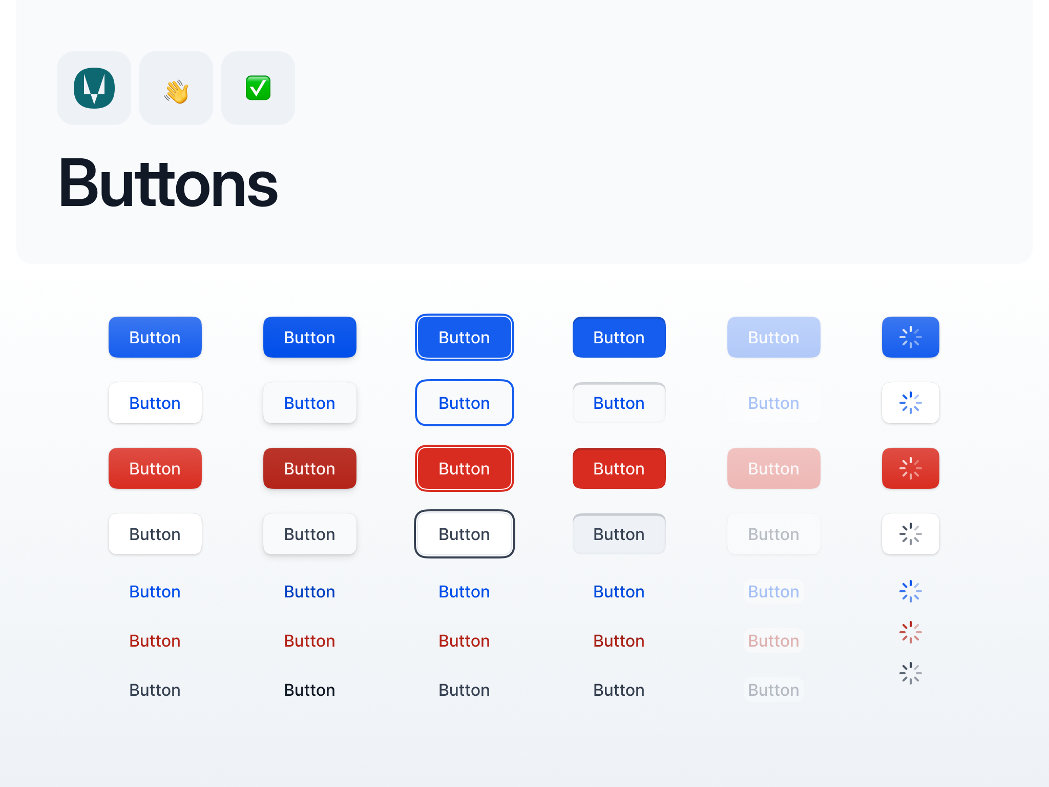
Start with the Figma UI kit, add production-ready React components, or scale access across your team.
For solo designers, developers, and founders using the Figma kit.
Features
Related Links
Preview in Figma →For independent developers building with Mavka components.
Features
Related Links
Explore Storybook →How Mavka helps teams align Figma assets, React components, and AI interface patterns.

Design Lead at Zenith AI
"Mavka gave us a usable token structure and AI-specific patterns from day one. We stopped recreating chat states and could hand off designs with clearer rules."

Senior Product Designer at TechFlow
"The Figma kit and React components line up well with our Tailwind setup. Storybook makes it easy for designers and engineers to review the same states."

Founding Designer at Lumina
"We needed a system that could stretch from prototype to enterprise dashboard. Mavka made multi-brand theming and AI workflow states much easier to keep consistent."
Need help choosing a license or checking what is included? Review the common questions below or contact the Mavka team.
hello@mavka.agencyPixel-perfect icons and production-ready vectors.
Hierarchical design tokens for precision control.
Figma assets, React components, tokens, and documentation in one product workflow.